~~~~~~~~~
The Story of Polioptics is a 10-part Web narrative based on a multi-media presentation — POLIOPTICS: Political Influence Through Imagery, From George Washington to Barack Obama — that debuted on college campuses in 2009.
In Polioptics Part 2, we looked at Founding Fotos — the images forming a visual aesthetic for a kid headed, years later, for the job at the White House tasked with visual storytelling. In this post, we key in on what, in particular, makes those images—and others like them—compelling.
Stanley Forman’s Pulitzer Prize-winning black and white image was only one of many that created the prism though which I saw America. On the multi-colored end of the spectrum, the Betsy Ross flag, and the mythology surrounding it, always stirred emotions. So, too, did the Golden Spike. Massive locomotives parked nose-to-nose, one coming from the East, one coming from the West, symbolized Manifest Destiny.
And though they were illustrations, not photos, Virginia Lee Burton captured the American can-do spirit in Mike Mulligan. The out-moded steam shovel, in the arena of the skeptical small town, out for one last gasp of glory. The grey grittiness of Dorothea Lange and the steely essence of industrialized America through the lens of Margaret Bourke-White, celebrated the human and engineering effort that built the country. And the exuberance of an America, victorious at war, was captured perfectly through the immigrant’s eye of Alfred Eisenstadt. The list goes on.
What are the images that are iconic to you? What conjures your youth? What embodies the place you all home? Almost everyone has their own collection, either mounted in albums or stored in their head. Nostalgia: delicate but potent.
Don Draper certainly knows about images and potency. Culled from the life experience of series creator Matthew Wiener, Draper, in the first season finale of MAD MEN, brings his audience to tears as he narrates flashing images of his family that form the carousel of life.
[youtube clip_id=”suRDUFpsHus”]
As Don said:
“…there’s the rare occasion when the public can be engaged on a level beyond flash if they have a sentimental bond with the product. My first job, I was in house at a fur company with this old pro copywriter, Greek, named Teddy. And Teddy told me the most important idea in advertising is ‘new’. Creates an itch. You simply put your product in there as a kind of calamine lotion. But he also talked about a deeper bond with the product, ‘nostalgia’. It’s delicate, but potent. Sweetheart. Teddy told me that in Greek nostalgia literally means the pain from an old wound. It’s a twinge in your heart far more powerful than memory alone. This device isn’t a spaceship, it’s a time machine. It goes backwards, forwards. It takes us to a place where we ache to go again. It’s not called the wheel, it’s called the carousel. It lets us travel the way a child travels. Round and around and back home again to a place where we know we are loved.”
Talk about nostalgia. In the 198o’s, the images in Time Magazine were my carousel, arriving in my family’s mailbox every Tuesday afternoon, greeting me when I arrived home from school. I’ve kept almost every issue, now stored away in file boxes. I can’t part with them. They defined the world in which I grew up. The ads and photos, together, laid out page-by-page, moving through the magazine from politics at the front to culture at the back, are a time capsule.
Reading the magazine in those years, my eyes gravitated to the scenes that Ronald Reagan’s imagemaker, Mike Deaver, created on the stump to showcase his boss. When I got to the White House, I reached out to Deaver, who became a sort of mentor of mine. Partisan differences didn’t matter: I was interested in his visual style—how he used angles, access and lighting to control the frame—and he was open in imparting his visual sensibility. When asked how Reagan was able to connect with people, especially when news coverage of him might have been critical, Deaver told reporters to mute the volume. The audience wasn’t listening, he said; they were watching.
When given the option, Deaver and his advance teams would put Reagan on a pedestal, literally. They knew that photographers shooting a subject from a low angle would capture a large dose of blue sky to frame the president’s head. It could have been a high stage, or the stair landing of a framed-out house. If the lens is aimed upward, the upward angle increases the subject’s stature.
Deaver knew his psychology. We have five senses: sight, hearing, smell, taste and touch. We use these senses to perceive, cataloguing the information we glean in our brains.
Which of those senses is dominant? Studies show that we get about 80% of all information through vision: light moving through the cornea, pupil and lens, bending as it falls on the retina and moves toward the brain.
In politics, what we see has a profound effect on how we’re influenced. Our lives are frenetic; there’s less and less time to read. How often do you fully digest a news story, word-for-word, as opposed to glancing at the picture to form an impression of the narrative? It’s a lot easier, or at least faster, to get a sense of a news article from the photo, or “art,” as photo editors say, that accompanies it.
Today, awareness of the “optics” of a political moment is more common than in years past. On MSNBC’s “Morning Joe” program, co-host Mika Brzesinski makes frequent mention of the impact of visuals while the show airs footage that runs over her banter with Joe Scarborough. It’s more in the open now — or at least there are more outlets to talk about it. Manufacture of image used to be a fairly well-kept secret, and news organizations generally steered clear of pulling back the veil. In the White House in the 1990s, at ‘event meetings’ every day in the Roosevelt Room, or one of many conference rooms within the Old Executive Office Building, senior aides would always draw attention back to the central concern and ask aloud the question: “What are the optics on this?” The answer would often decide whether or not the president should take a trip or participate in an event.
With all due respect to speechwriters, images can often dwarf what’s written, said and heard.
At the beginning of the last century, newspapers were text-only. Then photos started to appear to help tell the story. And eventually, especially with the arrival of Al Neuharth’s USA Today in 1982, color took over. USA Today’s once ubiquitous newspaper box transformed American sidewalks. It was not by accident that USA Today’s newspaper boxes were designed to suggest a television sitting on a busy street. Though, like pay phones, newspaper boxes are now disappearing, these kiosks had a purpose to their construction, serving as a window for passers-by to absorb the day’s events in a glance.
White House aides know this, as do Fortune 100 marketers. It’s why, despite protests of “over-exposure,” they welcome their principal on five news shows in a day. Psychologists calls this “the mere exposure effect”–people develop preferences based on nothing more than familiarity. (Research on this phenomenon—later described as the “glow of warmth”—goes back almost 150 years to Germany’s Gustav Fechner.) To measure the effect, researchers use a tachistoscope, showing how subliminal exposures create positive vibes. Show something over and over, and it begins to settle into the consciousness in an agreeable way. Just ask Don Draper.
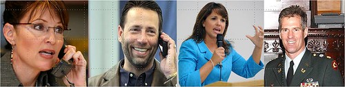
Palin, Miller, O'Donnell, Brown
People can say what they will about Sarah Palin, Joe Miller, Christine O’Donnell or Scott Brown, but a ‘mere exposure’ to any of them is not disagreeable. For these new arrivals on the national stage, their image is a compelling calling card that helps sell their message. And if their message is substantive, its an even more compelling package. Put this new generation of candidates on a split screen against opponents that central casting would label “career politician” and the contrast can have an effect on average voters. Palin has created her brand and Brown is in the Senate. It remains to be seen whether O’Donnell and Miller can close their deal with the voters.
How quickly can an image turn opinion? Research findings published in 2007 found that momentary images of the Israeli flag persuaded audiences to adopt more moderate political stances from the extremes at which they started. None of this should make us hold our breath that flag-filled rallies will usher in peace in the Middle East, but it’s not like the Israelis are alone in imbuing their parades with color.
While there are always new audiences to influence—it’s why ‘President-fatigue’ is often cured by increased travel abroad more in second terms—the exposure effect has a downside. New hit songs enjoy wide airplay on the nation’s radio stations, but only rarely to they become classics before another tune grabs attention. It’s one reason that advertisements, even the great ones, run their course and get pulled from rotation, their effect worn.
But when a classic does make a momentary return, we’re reminded why we loved it in the first place:
[youtube clip_id=”xffOCZYX6F8″]
The carousel of visual history we embarked on in Part 1 picks up in the next post where we left off in Part 2. The year is 1976. As the nation prepares to celebrate its Bicentennial, a battle brews between the perceived career politician, Gerald Ford, and the outsider, Jimmy Carter, enjoying the advantage of the mere exposure effect. In that campaign, Carter, of all people, becomes the man who ushers in the new age of the visual presidency.
~~~~~~~~~~
If you missed earlier parts of the the Story of Polioptics, begin at the beginning with Polioptics Part 1 and Part 2.
And then continue reading The Story of Polioptics. Additional parts of the narrative will appear every few days. When it’s complete, it will be archived it its own section of www.Polioptics.com.
Stay tuned for upcoming posts:
Part 4: Road to the White House
Part 5: Director of Production
Part 6: The 21st Century Presidency
Part 7: The Internet, Pop Culture and the Rise of Obama
Part 8: The First 100 Days…And the Next Thousand
Part 9: Port of Spain
Part 10: Homage to Image

Leave a Reply